Recent coin issues often behave in ways that surprise even experienced collectors. A coin released at face value or a modest issue price can reach hundreds—or thousands—within months, like some 2023 quarters did. This is not random. Prices rise fast when supply is engineered to be tight, demand is amplified instantly, and condition scarcity is measurable.
Modern markets move quicker than older ones. Information spreads in minutes, grading populations update in real time, and sellouts create urgency before secondary prices settle. Understanding these mechanics matters more than knowing dates or designs.

The Core Forces Behind Sudden Price Spikes
High prices on recent issues usually trace back to a short list of drivers working together.
- Artificially low mintages set below natural demand
- Minting errors that are easy to see and verify
- Perfect-grade competition fueled by population reports
- Event-driven releases tied to anniversaries or firsts
- Short-term hype cycles amplified by social media
When several appear at once, prices accelerate.
Low Mintage Is Not an Accident
Modern mints actively control supply for collector products. Production caps create immediate scarcity even before a coin reaches the market.
Examples include:
- Proofs and special finishes limited to 5,000–50,000 pieces
- Privy-marked coins tied to anniversaries
- Regional mint exclusives
When demand exceeds supply at release, resale begins instantly. Coins sell out, get marked as top-leveled in the coin value checker app, then reappear at multiples of issue price within hours.
This strategy contrasts sharply with circulating coins, where billions dilute value. Limited runs compress availability and force competition.
Why Scarcity Beats Metal Content
In modern issues, scarcity usually matters more than silver or gold weight. A low-mintage clad coin can outperform a common silver piece because buyers compete for ownership, not melt value.
That is why certain modern quarters or dollars eclipse bullion issues with higher intrinsic value. The market prices access, not material.
Error Coins Change the Equation Overnight
Errors inject randomness into modern collecting. A grease-filled die or doubled hub can turn an ordinary release into a key issue.
What makes modern errors powerful:
- They are unplanned, unlike low mintages
- Verification is fast through certification
- Visibility attracts non-specialist buyers
A single confirmed variety can create a new “must-have” coin despite massive base mintages. Once labeled and tracked, demand concentrates on a tiny subset.
Condition Scarcity and the Grading Effect
Modern coins are judged harshly. Perfection is rare, even fresh from the Mint.
Key realities:
- MS-70 populations are often under 100
- Small population changes affect prices immediately
- Registry competition rewards top holders
A modern coin in MS-70 can trade at multiples of the same coin in MS-69, even when the visual difference is subtle. The market values ranking as much as appearance.
A Simple Snapshot of Price Drivers
| Driver | Why It Works |
| Low mintage | Forces immediate competition |
| Errors | Create accidental rarity |
| MS-70 grading | Limits supply to tiny populations |
| Event themes | Expand buyer interest |
| Fast hype | Compresses demand into days |
These forces explain why recent issues can move faster—and farther—than older coins ever did.
The Mechanics That Multiply Prices After Release
Once a modern coin leaves the Mint, prices are shaped less by tradition and more by mechanics. These mechanics operate quickly and favor coins that concentrate attention into a narrow window. Understanding them explains why some releases stall while others explode.
Engineered Scarcity vs. Natural Scarcity
Modern scarcity is often designed, not discovered. Mints cap output well below anticipated demand to create instant pressure.
Typical tactics include:
- Ultra-low mintages for proofs, reverse proofs, or privy issues
- One-time finishes that are not repeated
- Regional or online-only releases that limit access
When a coin sells out on day one, secondary pricing starts without a cooling-off period. Buyers who missed the release compete immediately, pushing prices upward before fundamentals settle. Always use a free coin value app to monitor price fluctuation and avoid overspending.

Errors That Become “Keys” Overnight
Errors bypass mintage logic entirely. A billion-coin run can still produce a handful of desirable mistakes.
Why modern errors gain traction fast:
- Clear diagnostics make them easy to explain
- Certification labels legitimize the variety
- Population tracking shows how few exist
A grease-filled motto or a retained cud can turn into a recognized variety within weeks. Once a name sticks, demand narrows to a tiny pool of coins, and prices respond accordingly.
Grading Competition and the MS-70 Effect
Modern grading magnifies small differences. Perfection becomes a competitive sport.
Key dynamics at work:
- MS-70 populations remain tiny, even for new coins
- Registry sets reward top-ranked holders
- Price gaps widen between MS-69 and MS-70
A coin with fewer than 100 MS-70 examples can trade at multiples of its near-identical MS-69 counterpart. This gap persists because rankings, not aesthetics, drive the premium.
Event-Driven Demand Expands the Buyer Base
Coins tied to events attract buyers outside traditional collecting circles.
Common triggers:
- Anniversaries and centennials
- First-year designs or finishes
- Historical callbacks and privy marks
Event themes create emotional urgency. Buyers who do not normally collect coins enter the market, tightening supply further.
How Hype Compresses Time
Social platforms and instant reporting shorten the price discovery cycle.
What happens in practice:
- Sellouts are shared within minutes
- Early auction results set aggressive anchors
- Late buyers chase confirmation
This compression favors early movers. Prices peak faster, then stabilize once supply circulates. Some issues correct. Others establish a new baseline.
Driver-to-Outcome Map
| Driver | Immediate Outcome | Price Impact |
| Low mintage | Sellout | 2–10× issue |
| Named error | New key | 100–1,000× face |
| MS-70 scarcity | Registry demand | 50–300% over MS-69 |
| Event tie-in | Broader audience | 10–20× issue |
| Viral hype | Rapid bidding | Short-term spikes |
These mechanics rarely act alone. The strongest price moves occur when two or three overlap—low mintage paired with an event, or an error that also grades well.
Timing, Sustainability, and Spotting the Next Breakout
Not every modern price spike lasts. Some coins settle into long-term demand. Others fade once excitement cools. The difference usually comes down to supply visibility, collector depth, and repeatability.
How Prices Stabilize After the Initial Surge
Early pricing reflects urgency. Later pricing reflects reality.
Coins that hold value tend to share traits:
- Clear, permanent scarcity that cannot be expanded
- Broad collector interest beyond a single year
- Ongoing registry or set demand
Coins that fade often relied on hype alone. Once supply circulates and populations rise, prices adjust downward.
The Role of Population Growth
Modern coins face one constant risk: grading volume.
As more coins are submitted:
- MS-70 populations may grow
- Error counts become clearer
- Early scarcity assumptions get revised
If supply expands faster than demand, prices soften. Monitoring population reports becomes essential.
Patience as a Market Strategy
Immediate buying is not always optimal. Many modern coins peak early, then retrace.
Strategic approaches include:
- Waiting for population stabilization
- Buying strong coins in second-tier grades
- Targeting issues with multiple demand drivers
Collectors who skip the first wave often pay less while retaining upside.
Tools That Help Track Momentum
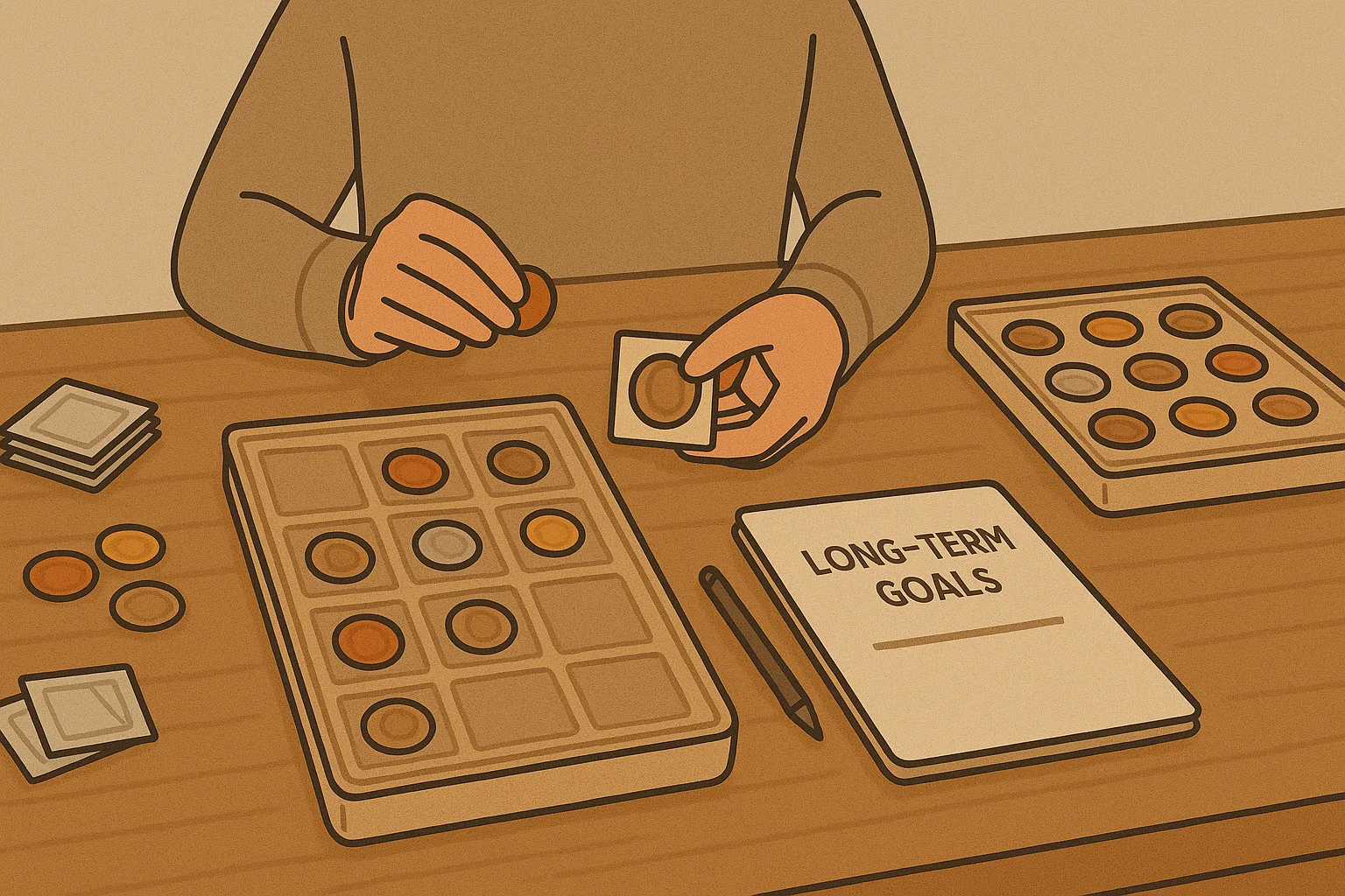
Following modern markets manually takes time. Some collectors photograph finds or releases and compare specifications—year, mint, composition, weight, and recent price ranges—using tools like the Coin ID Scanner app. Collection tracking and filters help separate genuine risers from short-lived spikes.
A Practical Checklist for Future Releases
Before chasing a new issue, ask:
- Is the mintage genuinely limited?
- Does it tie to a lasting theme or event?
- Are errors visible and verifiable?
- Do grading populations support scarcity?
If several answers point in the same direction, price pressure is more likely to persist.
Recent coin issues get expensive fast because modern markets reward speed, scarcity, and clarity. Mints design pressure into releases. Errors concentrate demand. Grading formalizes competition.
Understanding these dynamics turns surprise into strategy. Instead of reacting to price jumps, collectors can anticipate them—and decide which are worth following after the noise fades.